Breast Feeding in Public – A Month of Somethings!
Posted: October 2, 2016 Filed under: A Month of Something's, Breast Feeding in Public Leave a commentFor my last and final project for the second year I have chosen to look at breast feeding in public. with strong feelings towards empowering women and supporting body confidence I feel this topic is very relevant and relates to many people. I also aim to choose an area to explore that’s fresh and untouched by my creative mind.
As an individual who was breast fed and comes from a strong female driven family, I believe starting a child’s life with the ultimate starter pack of bacteria fighting nutrients is key to great health. Having not had a child yet, I will indeed turn to those who have in order to collect information and personal experiences. Internet research will also be carried out in order to understand how a breast functions whilst feeding and the effects of breast feeding. I wish to one day breastfeed my child!
Quick Exercise…
Posted: March 8, 2016 Filed under: Editorial Illustration Leave a comment

This was a quick exercise set by Anne. We were exploring the meaning of ‘cliche’ and the effects of using such images in our work. We found as a group that we agreed that it was quite difficult to communicate a message or meaning through imagery that wasn’t obvious or considered a cliche. Where as, it was scarily easy for us to produce work that is generic and over worked…this is definitely something to bare in mind!
Week No.3 – Gif
Posted: March 8, 2016 Filed under: Editorial Illustration Leave a commentFor the third week i decided to revisit week one. My 2D still image worked really well, but there was definitely room for development. For my Gif i wanted to expand on the movement within the teacup. this task took me a day to complete…
Week one – 2D piece…

To develop from week one i worked with the tea cup and diamond. My initial idea was to line the tea cup with cling film and gradually fill it with tea to submerge the diamond. Having spoken with my class mate Meg, she gave me the idea to use small cut up pieces of paper or card instead of liquid. This would mean i would not damage my cup and the theme of using paper would stay consistent. To represent the tea i decided to use pieces of square brown paper. i gradually filled the cup with layers of the paper and took photos. The build up of layers gave the impression of filling. The diamond eventually submerged. I incorporated the sugar cubes to, i approached this with the same method and made it disappear.


my final gif…
With this being my first Gif i learnt that the number of colours your image uses is reduced in order to reduce the file size. The effect of this reduction i think works quite. Its made the image grainy and the tea comes across more like tea.

Week No.2 – 3D to 2D
Posted: March 8, 2016 Filed under: Editorial Illustration Leave a commentUsing the same article from week one, we were expecting to produce a 3D box piece inspired by Joseph Cornell. As one of my favourite artists Joseph Cornell was featured on my blog a coupled of weeks ago. I used his work as inspiration for my War Horse project during the Christmas holidays. Josephs style of working evolves around his mass collection of found and made objects. Carefully selecting from this collection he narrates a story or highlights an issue or interest and presents it in a small container or box. I had a week to collect and rummage through charity shops and backs of cupboards…
My Box…
From the festivities of christmas i had collected a few things that had potential creative value. One of these things was a chocolate box from Marks & Spencer’s. Constructed from four layers this box held different assortments of chocolates. The box itself had a base that held the stacked layers and a sleeve that held them in place. The entirety of the box was in the shape of a hexagon. This quality was quirky and would be the perfect shell for my found arrangement.
I used the base of the box to hold my collection, i also painted it the appropriate shade of blue to match my tea set, this tied in tin my article. I recut a new sleeve using the old one, but this time i used white cartridge paper. On the exterior of the box i added a similar design in relation to my tea set.
For the inside, i arranged a miniature tea set given to me by my grandma years ago. I opted for the minimal approach for the inside. I covered all sides and base of the box to make it look clean and tidy. The tea set sat in the middle.


Photographing the piece…
With the resources supplied to me by Mal, i photographed the box with a multi-point-focus camera and 5 spot lights. I sat the box on a white sheet that stretched up the wall to give me a clean background. The spot lights i used ether had a cream or white tone when turned on. I used this to my advantage, i was able to create shadows on the inside of the box using the cut out silhouettes. The different shades of lighting allowed me to overlap individual shadows, this created layers and scenery. When documenting my work i always take the time to photograph it with proper equipment.


Final Piece…
Having taken quite a few pictures of my piece i couldn’t decide which to present as a my find one, so i chose two. The images below are the best lit and composed images, they include shadows, the shell of the box and the tea set. The first image is to the dimensions required in the brief (22 x 28cm). The image below i have left as the original size, i decided to not cut it down because it worked well as a portrait piece.

2.

Week No.1 – Image in Response to Article
Posted: March 8, 2016 Filed under: Editorial Illustration Leave a commentThumbnails…
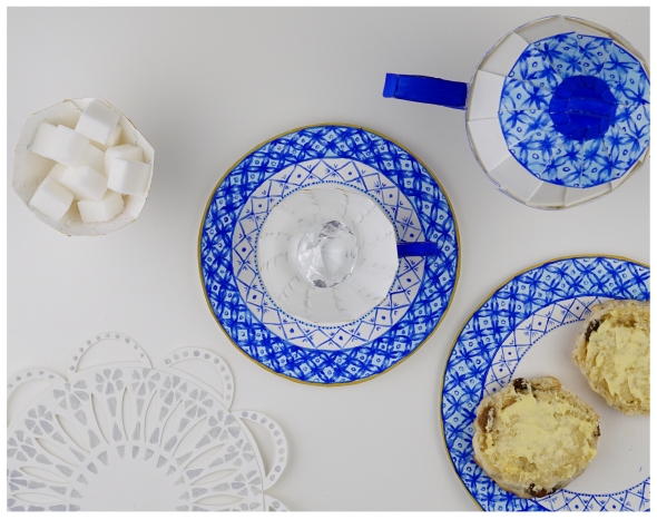
For my article the main issue i needed to cover is the constant battle as to whom owns the diamond. I felt it was important to include the element of fighting or arguing in my piece in order to communicate the gritty rivalry of the countries. From reading the article there were a few ideas that immediately sprung to mind. These being, a tug-of-war with a diamond, indian and british soldiers fighting, a very british tea party and a chicken laying a diamond instead of an egg. After speaking with fellow classmates and Anna, i decided that i wouldn’t go with an obvious arrangement to represent the article but something thats easily read with holds lots of meaning.
The tea party qualified. Being a british afternoon activity, drinking tea and eating cakes has become a worldwide link to the Victorian era. The tea itself is an Indian product and i thought the link between both aspects tied in quite nicely. Compositionally i think my thumbnail works, Anna also agreed and commented that the objects i have used are well balanced among the page.


Paper craft…
Having decided on my thumbnail i began to think about materials and how to was to create a 2D response. With paper being my favourite medium i came up with the idea to craft a 3D tea set and present my final piece as a photograph. below is a picture of my first attempt as making a cup and saucer. the shape of the cup i constructed with leaf shaped pieces. The shape of these pieces was relevant to tea and the shape of tealeaves. but after flicking through an amazing book loaned to me by Amelia, i decided that the cup was to complicated if i were to add additional design or detailing.


Painting…
This lead me to making this simple tea set shown below…After watching many tutorial on Youtube and reading origami books i came up with a simple pattern. I produced all the pieces in white cartridge paper with the scope to paint on them with watercolours and gouache.

Suggested by Anna, i carefully painted in the style of Willow. Willow is british china with indian inspired patterns painted on it. Its a limited palette of blues and yellowy golds. This style fitted perfectly with my article.


Photos…
I photographed my piece with the help and resources provided my Mal. I set everything up with crisp white backgrounds and appropriate lighting. The shot was taken from above, birds-eye view. when taking the photographs i had to consider the dimensions required for the final piece, this meant i had to zoom out to crop back in. Editing was also needed, as you can see below the photo i chose was quite green and a bit dull…

My final thing…
I’m extremely pleased with my final piece. The colours, composition, time taken to make and photograph everything, the size and proportions as well as the scale all worked to plan. Iv had great responses from fellow students and passing by tutors. Lets see what they have to say in the crit…bring on week no.2!!!
Three Week Project – Editorial Illustration
Posted: March 7, 2016 Filed under: Editorial Illustration Leave a commentFollowing the Field project we now have a three week project to end the term. This new project will be broken up into three parts each lasting a week. For the entirety of the three weeks we have the choice of using one article or a few. The article I have chosen to use is called ‘The Koorhinoor Diamond’. It is about the ownership of the Indian diamond that sits in the British crown jewels in the tower of London. I chose this article because its rich in visual imagery and the story line is simple but strong. Who doesn’t love diamonds?..

More about the diamond…
During the reign of Queen Elizabeth I many parts of the indian empire were seized by the british. This included, land, property, money and anything with antiquity value. amongst these riches was the home and very large diamond of a newly made emperor. At the age of five the new emperor was left to rule his kingdom with his mother by his side. Weak and easily manipulated he gave his kingdom and jewels to the queen mother Elizabeth I. in addition to this mass confiscation, the young king and mother were separated and she was forced into exile. Vulnerable and alone, the king was pressured into granting the queen Elizabeth permission to wear the diamond, this permission led to the cutting down and the reduction of karats to suit the size of her crown. The queen mother also forced the young king to forgive her. With nothing to his name, no family and no service to provide, queen Elizabeth sent him to exile where he spent most of his life.
engineers of the Imagination – PDP No.2
Posted: March 7, 2016 Filed under: Engineers of the Imagination, Engineers of the imagination - Part 2, Field, PDP - term 2 - Engineers of the Imagination Leave a commentOver the course of the five weeks I worked alongside Becky, Elliot and kubus. With each of us bringing something different to the table we worked extremely well despite the odd hiccup. Like the first half of field I worked with Becky and Elliot and found our skills were very contrasting. On the other hand, my new friend Kubus had an alternative train of thought. I found that just from talking to him that our brains spoke the 3D language. This was definitely exciting.
The poem given to us for the project i found hard to read and managed just about half way. Slowly picking up small parts of the text I made note of the scenery, characters and the many intertwining hidden themes. These elements of the poem deemed important for the making of our piece. Gathered with the group I relayed these important quotes and we applied them to newly born ideas.
From here an array of colours and large pieces of paper brought us to asking particular questions, these being; ‘how should the story be portrayed? And should it be obvious?’ would telling the story have a massive impact on our piece or not? And if so, do we approach it directly and show the actual theme or be ambiguous? And what would be the effects of doing so? We also questioned the purpose of the story, ‘is it at all a story or a hidden vessel carrying developments and ideas? This was solved by the decision to present the story as though told by the mariner as a future prediction of developments and destruction caused by new generations. This we discussed would only be portrayed through the appropriate use of materials and processes. We needed a material that was recyclable, man manipulated and also organic or natural. The importance of this led us to choosing paper as our base medium. From using the paper we were able to manipulate and push theories to extend our 3D techniques. When working with the paper we realised that the cut edges and clean lines can be used in many ways. This was also applied to curves and folds, the changes made to the paper were made to represent the different elements of our world we have manipulated, pushed and ruined to suit our selfish needs. Or as Elliot put it, ‘it is the constant collapse of our ecosystem, with each fold our world is slowly falling in on us!’.
To support our use of paper as a medium we turned to pop up children’s books and science books. The books were an example of how to use depth and dynamics when using layers. When reading the story you are pulled into the scenery and turning the pages becomes an exciting and magical endeavour. The collection of books was kindly supplied to us by Chris.
Moving forward, we produced a sketch for the layout of our piece. The flooded city represented the damage done by generations of people polluting and damaging there earth. The mountains are clear with land, perfect for habitants. Keeping the boat from ‘The Rime of the Ancient Mariner ‘, we brought the elements up to speed and gave it a new purpose. The albatross is represented by the drone; this feature has also been brought into the 21st century. We made these changes for our audience to familiarise and connect with.
With everything to hand and all planning complete we went ahead with the making and construction of the piece. To begin, Becky attached the buildings (all attachments were made with double sided sticky tape). Kubus was very successful with the trees. His pulling system was both professional and sophisticated. He used the technique of origami to construct the drone. Elliot’s mountains were the trickiest. It was a struggle to make them sit upright and collapse properly. My boat also presented me with many challenges, scale, structure and shape. All pulled through eventually.
Visiting our venue was very exciting; I had never been to ‘The World of Boats’ and the space provided was more than enough for the project. Run by a father and son, our venue is a café, boat restoration workshop and museum, as well as a restaurant. The space was a mixture of bright and dark rooms and the atmosphere was very welcoming. Chris gave me the honour of being the director of the main room, the restaurant/café. Being a reasonably sized room I was given a few things to consider. These things included; the layout of the artwork in the room, lighting and dynamics. All the requirements were met and the planning for the show was well on its way.
Having worked out the rest of the room the last thing to consider was where my groups work was going to be placed. Having made our decision very quickly we were able to firmly put our feet down and be content with the position in of our piece. This also meant that that we had plenty of time to think about possible changes and improvements. We chose the restaurant room, the main room. Our reason for this was because the clean white paper of our piece fitted in with the decorum. Baring in mind the ‘sailor’ theme running through our venue, I came up with the idea to place our piece on a stack of wooden pallets. The possibility of getting these crates from the owners of the venue became very slim, instead I loaned them from The Doctor Who experience next door.
Finally to conclude this terribly long essay about the second half of field, I wish to talk about the opening night and how I personally feel about this project. The show turned into such a wonderful evening, there was plenty of guests, food and drink plus live performances and artwork. As a group we performed a silent unravelling of our piece. We transformed a flat chaotic mess into a story telling landscape. It was a great performance, on the other hand we lacked the ability to hold our audiences attention for more than a minute. Over all I am pleased with the turnout of our work. We jelled amazingly as a group and the weeks flew by. The subject topic wasn’t too easy and presented us with a challenge. If I were to develop on this piece I would move away from the use of paper and experiment with scale. I mentioned to the group during the stage of planning about the impact of making the piece bigger, but they opted out and went for a more ‘manageable’ size. If I had the opportunity to work in a group again I would open my arms, but for the moment I think some much needed TLC on my own work is needed
CLICK HERE FOR MORE PHOTOS – FLICKR
Penarth Pavilion
Posted: March 3, 2016 Filed under: Engineers of the Imagination, Engineers of the imagination - Part 2, Field, Other wondering things apart from art Leave a commentI filled my afternoon with a long walk along Penarth beach and a coffee in the pavilion. love the floor and artwork…


Swimming with Swans.
Posted: March 3, 2016 Filed under: Other wondering things apart from art Leave a commentCosmeston Lake.

World of Boats – Ft CSAD
Posted: February 24, 2016 Filed under: Engineers of the imagination - Part 2, Field Leave a commentThe show turned into such a wonderful evening. There were many guest, food and drink plus live performances and artwork. Over the course of the evening, Chris introduced and thanked all the artists and helping hands for putting the show together. Me and the group performed a silent unwravelling of our piece and transformed a flat chaotic mess into a story telling landscape. I will definitely be returning to The World of Boats during the summer to enjoy the sun setting across the bay.


