12 Days of Illustrated News
Posted: January 26, 2015 Filed under: 12 days of illustrated news, Uncategorized Leave a commentI really enjoyed working on this project over Christmas. It was very laid back and relaxing to work on. Unfortunately I didn’t produce 12 pieces but i fully completed 9. Throughout working on this brief I tried to vary my use of materials and techniques. Here is my 9 days of illustrated news…
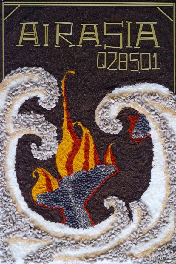
1. AirAsia – Flying oversea, a plane full of passengers suddenly crashed. Killing everyone on board, this devastating event meant that many families lost loved ones. Parts of the wrecked were founds as well as many bodies. To construct this piece I used a range of foods. These were; rice, lentils, sugar, ground tea leaves, two types of spice and dried spaghetti.
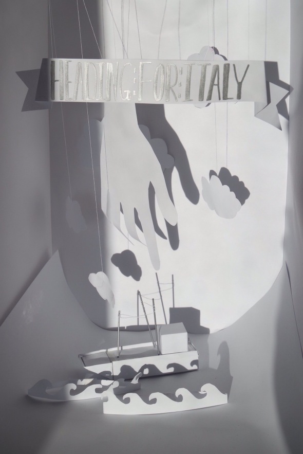
2. Heading for Italy – A cargo ship filled with immigrants was abandoned by its driver of the coast of Italy. Stranded, the immigrants were fleeing their country in search for refuge. I chose to use paper for this piece because of the purity that is reflected in the lack of colour. I was going to place a small light inside of the ship and cut out small windows, this would have allowed Rays of light to shine through representing the hope that the migrants would have felt for the need of safe passage and new welcoming home. The hand featured in this piece represents the rescuing of the immigrants. The Italian coast guards and authorities made it safe for the people to come ashore.
3. Catnip for Christmas – Families, churches, schools, companies and organisations were donating used and unused Christmas trees to a zoo in northern England. The Christmas trees were used to entertain and keep the lions and big cats of this zoo warm. The trees act like catnip to the big cats and help keep them calm. The trees were also used to help maintain heat around the zoo as they acted like a fuel source.
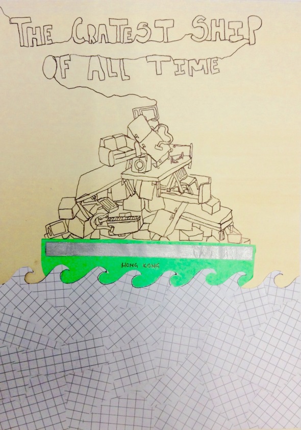
4. The Cratest Ship of all Time – Pulling into the docks of Britain was the biggest floating cargo ship ever built. Longer than the shard this ship was carrying electrical goods, recycled materials, shoes, furniture and many more things. To illustrate this news article, I produced a continuous line drawing to represent the endless amount of goods stored in the containers. This drawing was also accompanied by ripped graph paper for the sea and a green panel for the boats bottom.
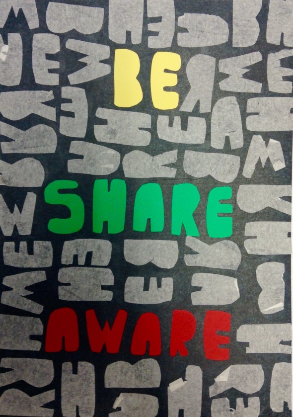
5. Be Share Aware – A campaign held by the NSPCC was publicised on the TV and in all national news papers. To help make young adults and children aware of the dangers of sharing private and confidential information, two videos were made as examples of the bad things that can happen. For this piece I used typography. I felt that a message was best read through the use of bold text. The NSPCCs slogan ‘Be Share Aware’ was the main message in this campaign, I used the colour of this organisation, red, yellow and green to highlight the text.
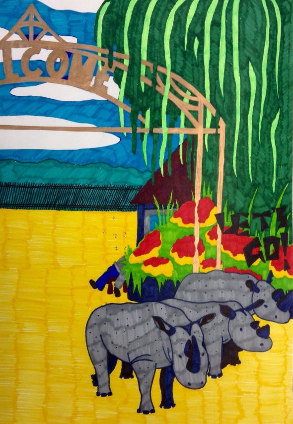
6. Let’s Go! – Three adventurous rhinos wondered out of a zoo in southern England. Unguarded by the sleeping guard, the three rhinos slowly made their way out of the zoo and into the car park. I added more colour to this news story. I am not satisfied with my result, I don’t thing the use of the sharpies gives the story justice.
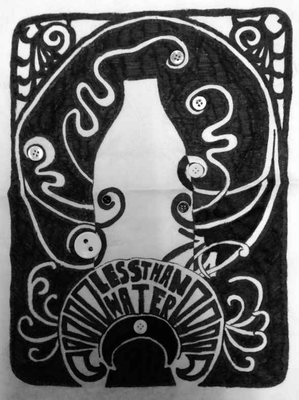
7. Milk Less Than Water – Farmers and supermarkets are disgusted at the price of milk. Being sold for less that the price of water, many supermarkets are challenging the welfare of farming and value of produce. When illustrating this news story I recycled an old bedding sheet and drew using fabric pens. Ones finished drawing I sewed buttons to add detail and fill void areas. After completing the illustration of the glass milk bottle I then noticed when I turned my work upside down that it also looked like a cow….moooo!!
Upside down…
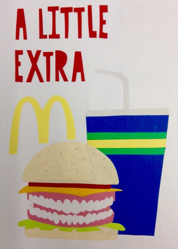
8. A Little Extra – In Mc Donald’s restaurant a tooth was found in a portion of fries, a shard of metal and a piece of plastic was also found in a burger. I found this news article quite funny! I used the humour from these findings and placed a set a dentures in a burger, they replaced the meat. I kept this illustration quite simple and I used cut out pieces of coloured card. I thought the funny side of the teeth would make up for the lake of detail.
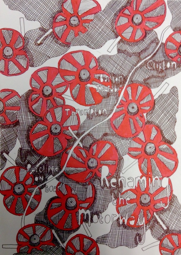
9. Renaming the Motorway – A motorway was renamed in the remembrance of all the past soldiers who fought in the war. Worldly know to commiserate the lose of lives I used the poppy as a symbol of remembrance. Covering the page in poppies I left a small path way to show the shape of the motorway, also labeled you can see which towns will cherish the memorial gesture.
My Zine
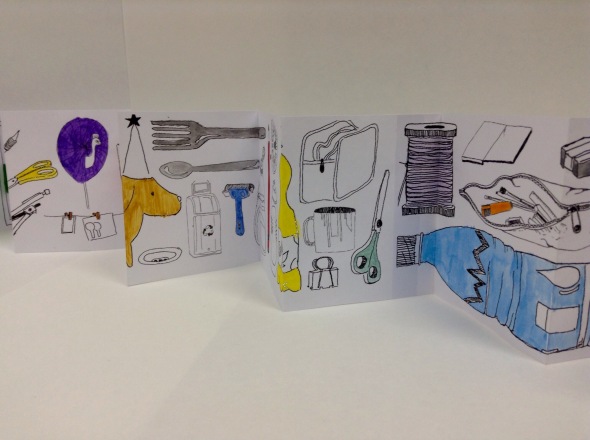
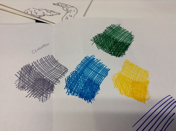
Posted: January 26, 2015 Filed under: Zine Leave a commentA short but simple project was the Zine. Very popular to make and cheap, this way of working is quick and very affective when studying objects, people and the place around you. By documenting objects I found around my studio i categorised them into groups of location within the space. I used a fine liner to sketch each object, then I scanned them all in and arranged them to form a concertina. Once printed and stuck together I added simple patches of colour. Mainly pastel shades, the objects were flat and soft. For the front cover of my Zine, I enlarged an item within the collection. This I cut to fit. I really enjoyed this way of working, it helped me to focus on smaller details and narrow my thought of thinking.
Time Passing – part two
Posted: January 26, 2015 Filed under: Time Leave a commentFor part two of the Time Passing project, I was instructed to develop my previous 40 images and expand on the uses of view points and angles. Time was also a main feature in this extension. I was told to question the fabrication of time, what happened five minutes before? What happened five minutes after? With this I focused my attention on the content of the picture. The ballerina in the photograph caught my eye, she sat elegantly on the horse and was the main focus of the show. I can relate with this character as I used to dance for many years. Thinking about performance I questioned what were to happened if she was to fall of the horse or miss place her step. How would she be perceived by her audience? Would she be able to recover from her mistake without anyone noticing? Would she be judged?
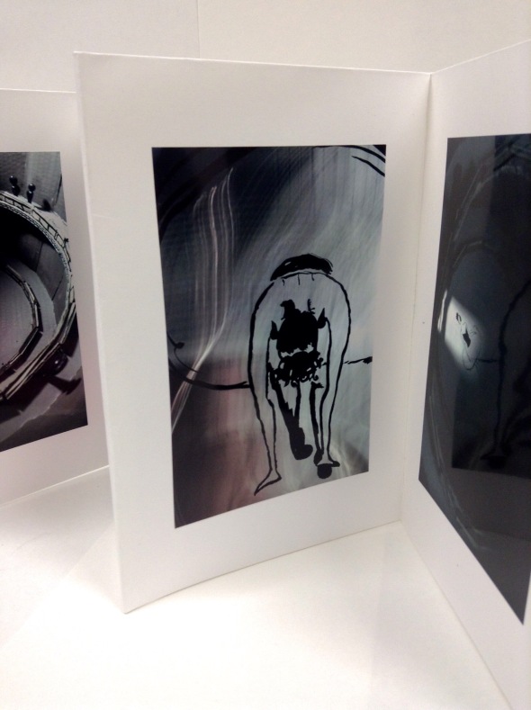
Placing her in different dance positions, I began to tell a story. I chose to work with in a time frame of seconds rather than minutes since she is dancing. I worked with ink and a large paintbrush to illustrate flowing line and movement.
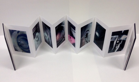
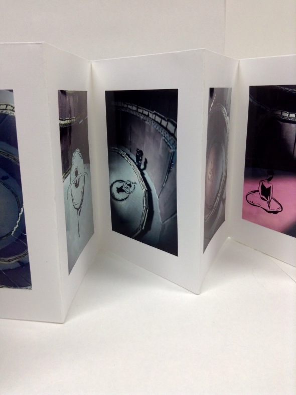
To incorporate my ink drawings into my previous work, I scanned and photoshopped the dancer into the photos. Working with the the effects from the lighting and the shadows, I blended her into the theatre. When looking at the end results it made the dancer look at though she was dancing in a part of the theatre where you couldn’t see her, but you knew she was there because of her shadow. I again presented this series of work in a concertina. It helps the images the flow and tell a story.
Personification – The Trenches
Posted: January 24, 2015 Filed under: Personification Leave a commentPersonification is giving an inanimate object a life or emotion. To kick start this project I began by exploring my surroundings. The studio space, outside, other buildings and stuff on my desk. I was asked to bring things in such as:
– vegetables
– art equipment
– kitchen utensils
– clothes
– plants
– conkers
– dried leaves
– twigs
– etc
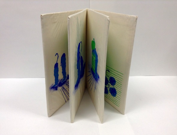
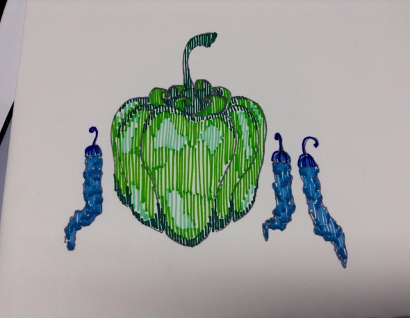
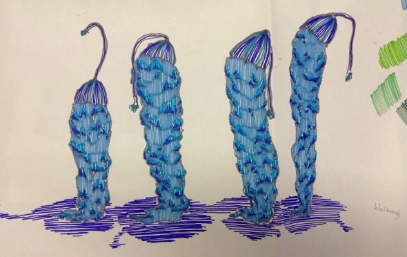
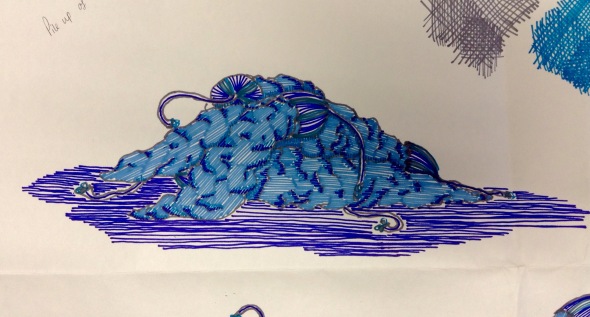
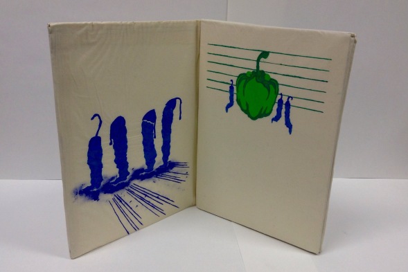
When I had chosen my items to work with, I was given a choice of 4 war poems. Based on my interpretation of one of these poems I had to personify each item as though they all had life. Being restricted to only two colours, but a range of hues from those colours, a series of illustrations was asked. I chose the poem ‘…..’. It is about the acceptance of dying and the passing of body and soul. For my items I chose to work with small, red, dried chillies! giving to me by Chris, they had been sitting on my window cill for quite some time and need a use.
Representing the dying soldiers in my poem, the chillies worked well. They were all skinny but stood at different heights. The stalks on the tops of the chillies looked like helmets worn by soldiers. The dryness of their skin made them look withered and decayed. To accompany my small chillies I also used big red pepper. In my poem the pepper represented the hand of death itself. Very big, confident, abrupt.
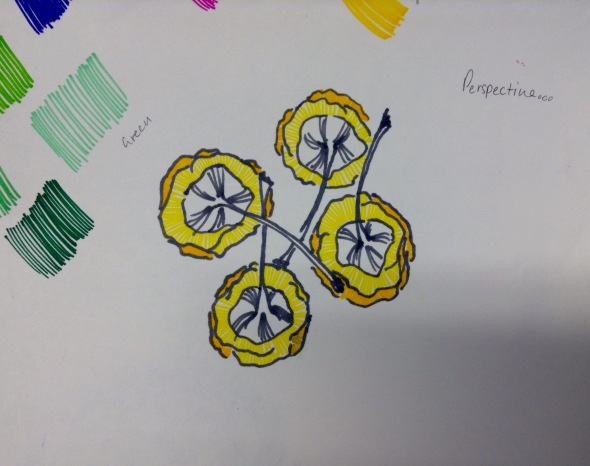
The colours I chose were green and blue. Having reflected on the colour project, I found those colours were cold, neglecting, dull and made me feel sad. I also asked for the opinions of my colleges and they agreed. I used three hues each for both of these colours as I was trying to keep it simple.
The brief also stated that I needed to produce a 12 paged book. So I decided to expand on the book idea and make it out of fabric. It thought this would also add to the grimy, grainy feel of the poem and the context. For my choice of technique I used stencils and worked with a layering method. Having three hues of each colour this method worked well. I divided each image up into layers and printed them accordingly.
Once all dried, I added finishing touches and sewed my book together. Each page was A3 so I cut sheets of foam board of which I placed inside to make the pages sturdy. If I was to improve of this project, I would have make full use of the printing facility. But I am pleased with my results.
Time passing
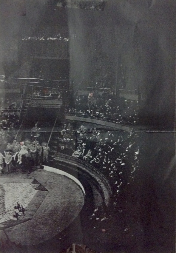
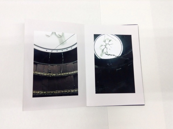
Posted: January 24, 2015 Filed under: Time Leave a commentFor this brief I was given a photograph taken from a book called ‘…..’. This photo was of an abstract shot from an awkward level in a round house theatre. Quite old and run down, we can tell the photo was taken many years ago. The building itself held much character and history. My task for the brief was to explore the many different view points within that space. For example, I had to imagine what I would see if I was sitting on the horse featured in the photo, or if I was standing in the very centre of the stage. My photograph was perfect for this project, it is a large space, filled with loads of people and full of life.
With this photograph I was instructed to illustrate 40 responses. These could be of any size, use any materials but had to be explorative about view points and angles.
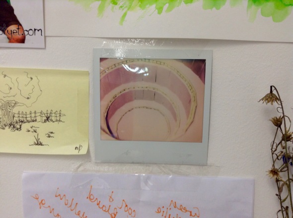
When starting work on this brief I struggled. Working 3D most of the time I sometimes find it hard to revert back to drawing and painting. So as a result of this I spoke to Anna and Chris, they both advised that I pursue working 3D, but also push my other use of materials and discover other mediums. This led me to using the cardboard in our studio. Instead of focusing on the people and content of the photo I looked at the context, the space itself. Using the cardboard I quickly built a rough mini version of the theatre. It replicated the growing circles and spiralling structure of the theatre in the photo. I was very pleased with the result.
I was in two minds about painting the theatre, the 40 responses were only meant to be quick and I didn’t feel the need to consider colour to much, I was more focused on shape and form. But listening to the opinions of colleges and tutors I painted it! I used a pallet of colouri from the theme of the theatre, it gave the cardboard a bit more life.
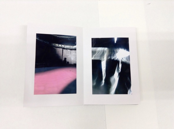
Once the theatre was complete, I thought about working with other materials. Documenting 3D work through photography gave me the idea of expanding my use of camera equipment and effects on photographs. Following this I spoke to a tech man call Mal. He is based in photography and helped bounce ideas as to developing my work. He introduced me to a small camera no bigger than the palm of your hand. Predominately used for parachuting and skydiving this camera is very light, takes pictures quickly and is completely unpredictable as to what you are going to capture. Being very small it means it can be placed in tight or small spaces. Perfect for my mini theatre!…
Before photographing the theatre, I used a glue gun to make small, simple silhouetted figures of people. These i coloured in black and we’re all unison. They represented the endless audience that sat in the theatre in the original photograph. Colour was also another aspect when thinking about mood and atmosphere. When lighting my theatre, I placed pieces of coloured acetate in front of the bright lights. The effect of this caused shadows and mystical effects. The camera was small enough for me to place inside the theatre. But not all of my photos that I took were in focus or great. Still I placed them within my 40.
I presented my finished 40 images in a concertina. This allowed my work to flow and each image could be related to the next.
Colour Project – Leaning From the Steep Slope
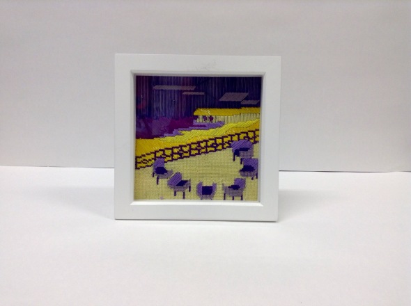
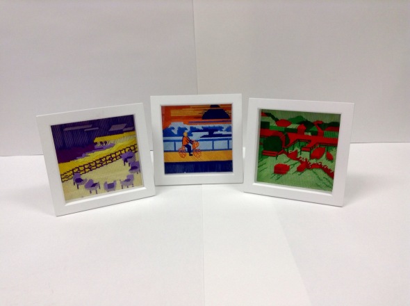
Posted: January 24, 2015 Filed under: Colour project Leave a commentThis brief involved the interpretation of a piece of text called ‘Leaning From the Steep Slope’ – Italo Calvino. It was my task to produce three images, scenes or compositions as a response to the text. I found this piece of writing quite heavy, as I struggle with reading I only began to understand and imagine ideas once Anna had read it out aloud. It was very difficult to imagine myself within the place and connect the appropriate use of colours to my work.
Colour Project
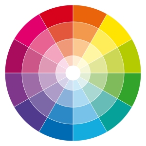
Posted: January 24, 2015 Filed under: Colour project Leave a commentThe colour project was started with a series of workshops. Focusing mainly on colour I re-capped the basic colour wheel and primary/secondary colours. Doing these small exercises really expanded my colour vocabulary, i was able to produce select colour palettes and visual risponses to follow through into my end piece.
Words To Draw By – Story
Posted: January 24, 2015 Filed under: Words to draw by Leave a commentContinuing from the workshops and experimenting with a wide range of materials, my brief was to illustrate a story of my own using words to draw by. As well as considering the colour workshops and any influential artists. I was over the moon when receiving this task. Having illustrated friends and families stories in the past I was excited to be illustrating my own! I had so many ideas.
For this brief the aim was to create more than 5 characters that were peculiar, interesting and bizarre. I was also given a list of character ideas to consider:
– stranger
– villain
– village idiot
– youngest
– oldest
– king or queen
– mother
– rogue
– hero
– false hero
– wallflower
– saviour
– lover
– pet
– side kick
– prize
– chosen one
Study skills – Mayanz Shahs
Posted: January 24, 2015 Filed under: Study skills Leave a commentQuestioning everything…
The study skills session with Mayanz was interesting. She questioned the relevance of line, colour, form, structure and volume. She told us to think about why we use these factors and why are they so important to our practice. Maynard also made me question the difference between a maker, an illustrator, a sculptor, graphic designer, product designer and fine artist. Since we all live in the same building we would all be classed as artistic and creative people. What is the difference between us all? The relevance of my practice was also challenged and made me query what the importance of being an illustrator is? What do I do? and what do other people perceive from illustration. Thinking about the weeks ahead and projects to come, I have started to question how I can collaborate and make the most of working along side another creative person. As well as what impact it would have.
Keynote lecture and study skills – Alexandros
Posted: January 24, 2015 Filed under: Lecture Leave a commentThe lecture held by Alexandros was quite amusing as well as helpful, I also found this with his study session. As his lecture and study session were about the same thing I have decided to combine it into one blog post. The subject of his talks were about Sonic Arts and the expenditure of computer and electronic science. I found it difficult to relate at times when he was explaining the properties of this subject. However he did also speak about improvising with strange and obscure materials. As I normally work with paper, cardboard and other heavy materials, I found this interesting and began to think about the relevance of other possible mediums. Using the work of Max Mathews as an example, he made me realise that there is no stopping to limits, as this man was the first electronic musician to create every sound with a computer. He pushed the boundaries and constructed a composition of sounds in a very different way. I found this spontaneous and would like to inject this into my practice.
I was inspired to push boundaries and exceed the limits.








 </a
</a
